Ryan Up In Here
Portfolio
Role
UX Designer & Developer
Timeline
2 Months (2026)
Tools
Figma, Next.js, Tailwind
Platform
Responsive Web App
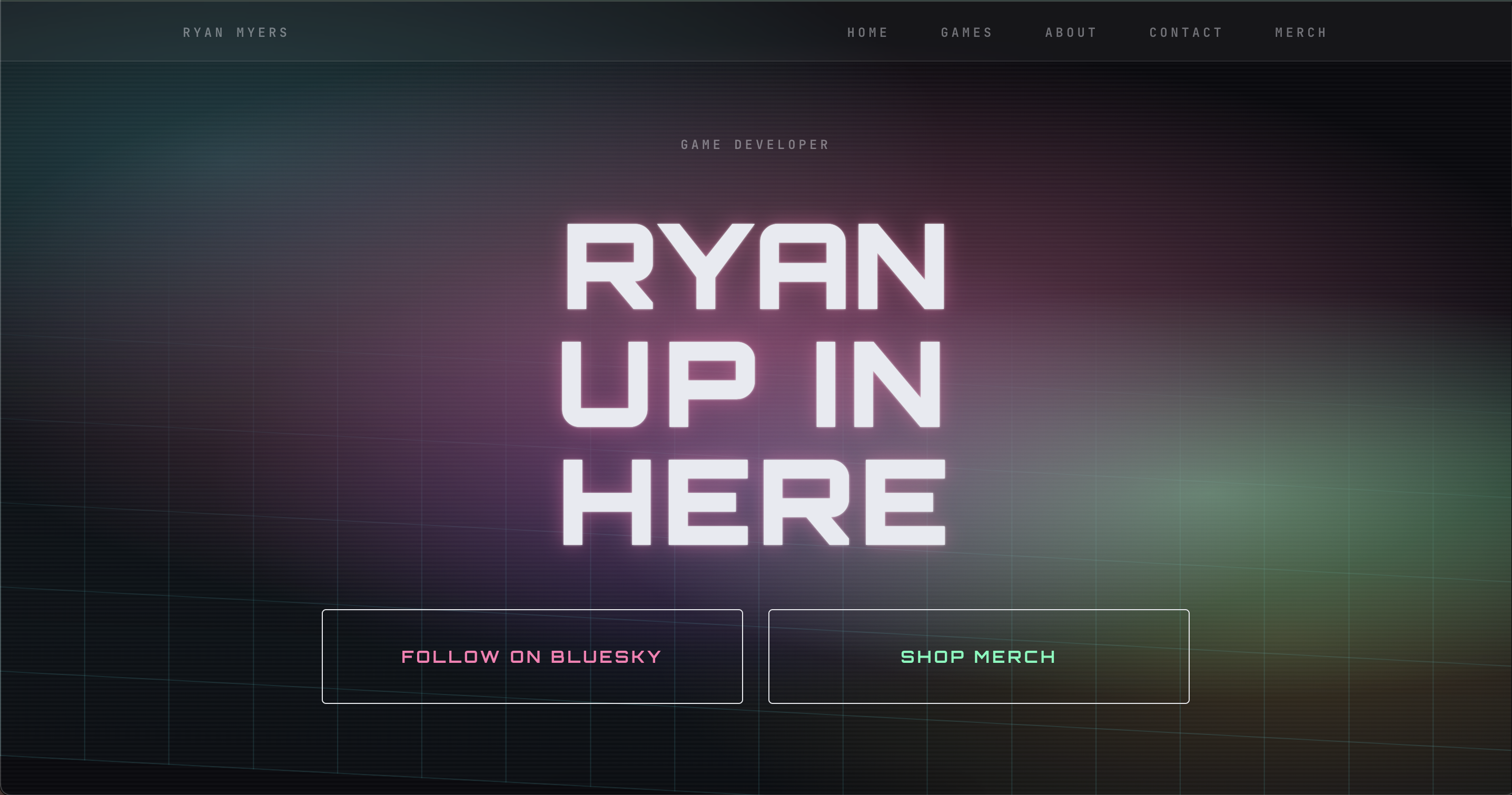
A responsive portfolio website crafted for Austin-based game developer, Ryan Up In Here. I designed the site to highlight visual hierarchy, content clarity, and polished interaction states across wide screens.
Goal
Building an accessible, high-energy gaming portfolio designed to scale
The goal was to create a responsive portfolio that balances rich, cyberpunk visual storytelling with fast cross-device performance—ensuring high-contrast neon accents and dark grid layouts feel bold on widescreen displays while remaining clean, accessible, and uncluttered on mobile.
A refined browsing experience
Build a layout that scales cleanly from wide monitors to smartphone screens while preserving strong typography and hierarchy.
High-fidelity presentation
Create compelling visual sections that highlight backend and gaming projects through a minimal cyberpunk aesthetic that feels polished, intentional, and accessible on any screen size.
Desktop
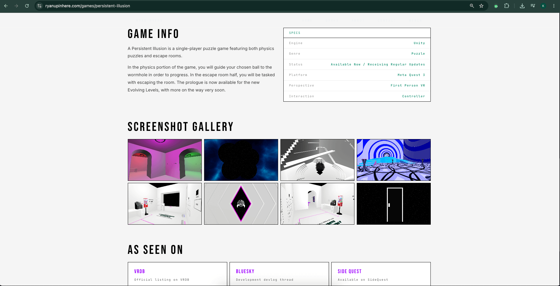
A widescreen, high-contrast desktop experience
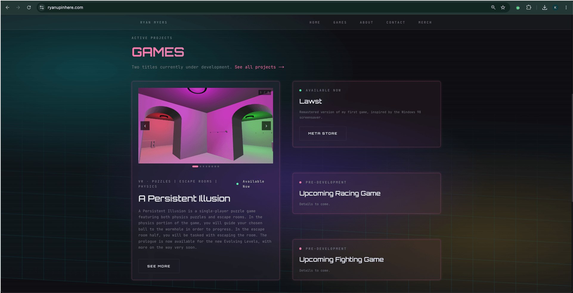
Structured content flow
The desktop layout acts as an immersive terminal for Ryan's backend architecture and video game environments. By pairing a dark grid background with vibrant neon accents, the aesthetic leans heavily into a fun, cyberpunk vibe while remaining strictly accessible. Generous whitespace and a consistent top header bar keep the interface minimalist and clean, allowing the high-contrast elements to pop naturally without overwhelming the user on larger screens.
Mobile
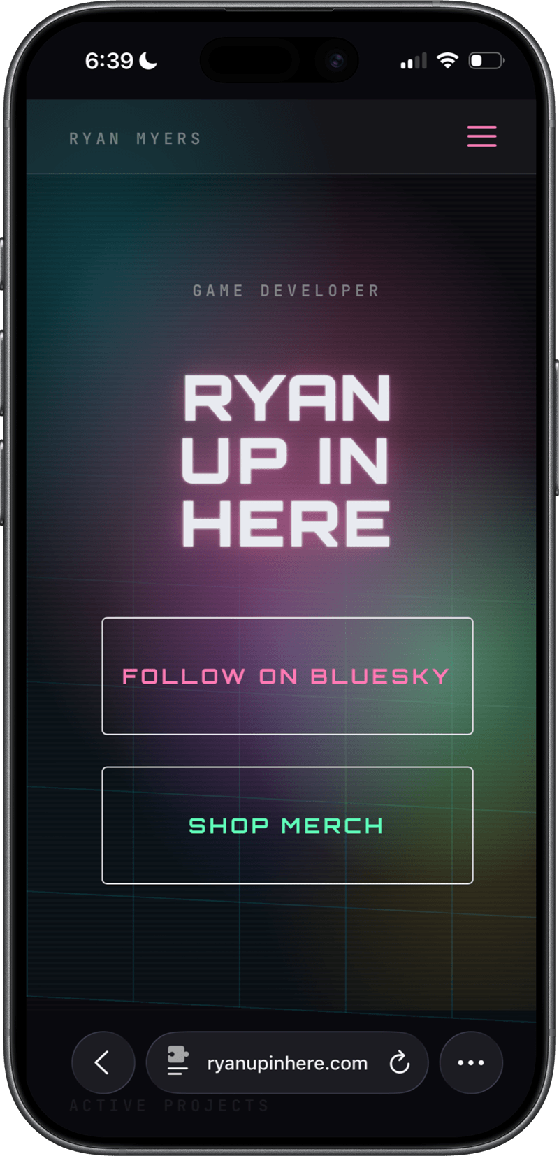
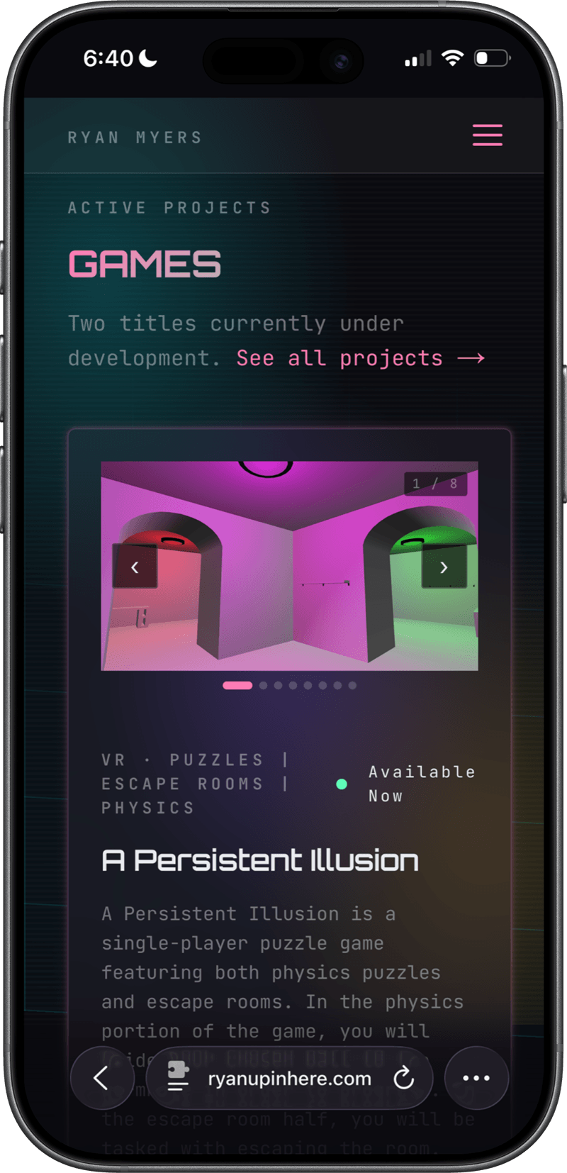
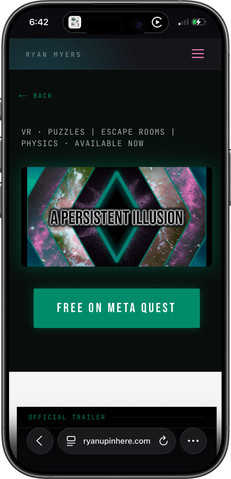
A fluid, fully responsive mobile web app
Translating the cyberpunk aesthetic to mobile required precise spacing to keep the bold visuals from feeling cluttered. The dark grid and high-contrast neon accents scale down seamlessly, preserving clean whitespace, full accessibility, and a fluid web app feel on smaller screens.
Results
100%
Lighthouse Score
0.7s
Load Time (LCP)
100%
Best Practices